Isabella Boedeker
Managing Editor
Design
At the end of my sophomore year, I knew I wanted to take on a greater role in the class, so I interviewed to become a section editor. Although I was open to any section, the executive team at the time selected me as the news section editor, which aligned with my passion for reporting and covering complex topics. While I’ve never considered myself particularly creative in design or art, I was ready to face the challenge of navigating InDesign. Through perseverance, I learned what it truly means to be a leader. Each month, as I created new page designs and collaborated with writers on my section, I discovered how to take charge while also knowing when to ask for help. From starting with basic page layouts to designing pages that matched my bold ideas, I’ve overcome my fear of making mistakes and embraced the process of growth.

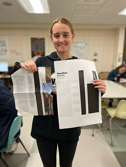
In this photo, I created a mock-up design on InDesign, despite having no prior experience with the software. This moment marks my starting point, and it serves as a reminder of how much I’ve grown since then.
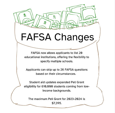
This is one of my favorite designs, showcasing my ability to work under pressure. When the original infographic for this page fell through, I quickly adapted by capturing this image and using InDesign to add relevant facts, turning the situation into a successful solution.
Click image to take a closer look.
The Process of a Page Alternation
The usual
Above you see a before and an after, but what you don’t see is my concern for fixation. Normally, our news infographics are large and take up space as shown in the before picture. The infographic is detailed and shows complexity, but it’s too large. MIPA critiqued our infographics as a way to take away white space, thus after consideration, our infographics will not be as large. The picture to the right represents the start of the FAFSA infographic, which is what sparked a reason to change.

The Product
The change wasn’t entirely my idea, and it took time to craft an infographic that seamlessly complemented the story. Our class typically relies on Canva templates rather than creating our own, but after seeing MIPA award-winning infographics, I was inspired to raise the bar. The graphic to the side shows the result of that effort, and from that moment on, our class moved away from using the standard Canva templates.

My Best Page Designs
Click the images to get a closer look.

Drafting Detroit Pride, Volume 57, Issue 8.
I chose this design because it captures the energy and pride of Detroit as it hosted the NFL Draft, highlighting the city's revitalization and the passionate community surrounding it. I love how the imagery and layout emphasize the unity of fans and the excitement brought by this historic event. While it may serve as a basic layout, I played around a lot with the image and finding the right spot for it.

Dr. Andrea Tuttle appointed new superintendent, Volume 57, Issue 4.
Designing a page for school board stories has always been a challenge, as I found them difficult to present in a visually dynamic way. However, as the news editor, it was crucial to collaborate with the writers to ensure they captured compelling visuals that enhanced the story. Beyond that, I appreciate the color scheme and the use of a pull quote, which help make the page more engaging and visually appealing.
MIPA: Honorable Mention

Pit bull ban in Grosse Pointe Shores, Volume 57, Issue 2.
This page design marked the moment when I truly started feeling confident in my Adobe InDesign skills. I coordinated the shot with the dog in the foreground, believing it added depth and emotion to the story—especially since the previous artwork lacked impact. This template served as a strong foundation, one that I continued to refine and build upon throughout the year.